Neil's made some suggestions, but I want to offer a couple of hints too, as some of the uploads are a little 'dull' easy to remedy, back laters
Balancing contd...
I take Paul's point that he has already done much adjusting on his uploads to achieve a certain effect, and I do not as a rule now 'tamper' I would be interested to hear from Kate and other if I am right, in assuming this 'subtle' one click remedy does bring a little 'true' brilliance back?
Assuring you my best attention at all times, he who creates, debates, curates, and many other things that rhyme...but we won't go there!
Ron
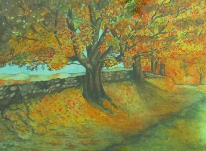
The Balancing Question..I have taked the liberty of using Kate's PIc to illustrate
Pic One Autumn Trees by Kate Gold as seen, it is to my eye just a tad 'milky'
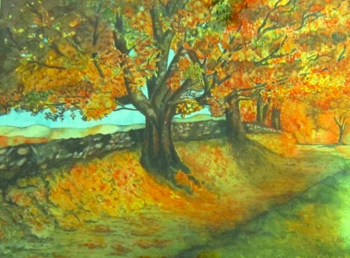
PIc2 the Same Picture, untouched apart from the application of 'Auto Adjust' in Preview ( mac app )
How would you go about levelling this Photo without Photoshop, or a spirit level?
Ref: Balancing pics
I'm not going to go Full Monty here, in case we have a Granny Egg Sucking situation. But whilst Neil's spec for the Art Department proper, is fine and easy for me to pick them up to drop onto the FaceBook page, a couple I notice are a little dull. I take the opportunity on all files to re-balance them them, I only use the 'Preview' the App that is bundled with Apple Machines, I am mindful of retaining the original integrity, so I only ever use 'Auto Levels' a one click solution that brings the brilliance back, and the results are excellent.
I do not increase saturation or anything that is likely to interfere with the artists' intent. Most of you will be equipped with Photoshop, but it's quite unnecessary for screen work. Sometimes, for my own work ( photos ) I might use Picassa, the free to use tool, as with that you can also adjust 'tilt' if say your horizon needs levelling.
I am a little cautious here when if it comes to monochrome or pencil work such as Les Orton's as the quick fix will take a background to white, and I wouldn't know if the drawings were on white or off white stock. So if there are any members who are not happy, please let me know.
I do a fair amount of work for Property agents, who often supply pics from pocket cameras. These are excellent devices and very practical, all will come with a free App to make all sorts of adjustments on screen, but I always advise not to use flash, as this flattens everything. It is surprising what can be achieved on screen with the likes of Picassa, from the rawest darkest file. Having what looks like a bright room rather than a dungeon, or sunny garden rather than an overcast one is most important when appealing to the eye, on the later I do cheat sometimes.
If there is anyone not conversant with Apps such as I've mentioned, most have slider controls, to adjust:
Exposure
Contrast
Saturation
Tempertature
Tint ( colour bias )
Sharpness
Mono/colour
Size and resolution can also be adjusted.
If this topics warrants further discussion, I would be interested in your comments.
Keep up the good work everyone
Ron