Logo Train


LogoTrain


DECEMBER 7, 2011


A plastic building brick toy for kids? No, that would be Lego Train. Jogo train? hmmm interesting, a fitness App perhaps? You get my drift. I’ll do a link just in case you’re not sure what one is LOGO. Read that? Even kids know what logos are, they are the things marketeers stick on the side of trainers to quadruple the price of products, the things that make Teens refuse so wear a certain garment, if it’s not the one their peers have. OMG what have we done? Designer nappies? We have all gone bananas, when’s the last time you saw a banana without blue sticker? Yes the Fyffer calls the tune when it comes to the Brand Brain wash.


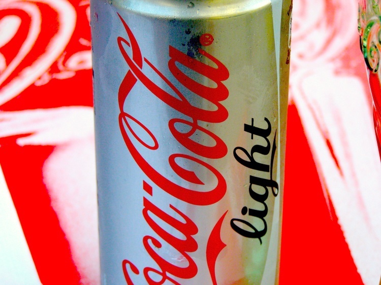
The thing is it’s not a new phenomenon. No, we have been drip fed this mumbo jumbo for decades, probably Centuries, if not eons. Some of the naughty big businesses out there even cheat. If you ask any Western child what colour robe does Santa wear? Resoundingly they would infer the same color red as the Cocoa Cola label. ( I use the American spelling of color for poignant effect ) Well, red is probably what they would say. But the fact remains that, Saint Nicholas,who can historically be proven to have existed, was an orphaned child from the former Greek ( now Turkish ) Myra Region. He devoutly followed the Biblical dictates of Altruistic behaviour, by selling his inheritance, and giving the proceeds to the poor and needy.


Clicking through the Wikipedia offerings you will see many derivations, and transmogrifications, Kris Kringle, Saint Nicolaas, Zwarte Piet (the Moorish influence) Sinkerklass and the European versions may even have eminated from Odin. As with all Religious derivations, facts are often fused with myth and fiction, factions would borrow a traditional myth or figure and make it their own. But here, there seems to be the commonalities of 'the Gift giver,' the arrival in the Winter Months, the Protector of Children and Sailors, often rewarding the good and punishing the bad, links with Jesus Christ, but above all an Altruistic ideology to give and not to receive, a concept which goes back well before the birth of Christ.


Saint Nicholas became a Bishop, ( hence the red cloak ) and all round good egg, and was subsequently much persecuted, ain’t that always the way? See this astounding article on the play in his honour. The Players are Azzo, Pia and Cola Cola: ‘Tis sweet Saint Nicholas that most I praise, He giveth help through all the long, hard days.


His attire throughout the ages has been depicted in the main as red robed, although he was, and is, manifest in different attire indifferent countries and cultures. Oft depicted as a green robed Father Christmas in the UK, a black-robed Good Witch in Italy, and err..non-existent in Mexico, it was The Coca Cola Corporation who hijacked the kind and giving but unfashionable Santa, gave him a make-over, added matching trousers, some fluff, and claimed him as their own. We all now think that Santa works for Coke. No irony intended.


Which ever way you look it branding, brand loyalty, mass marketing, sponsorship, theft, fraud and secrecy all seem to have played a part in creating the biggest most valuable brand in the world. ( it is alleged ).


If you do nothing else today go to Wikipedia and read the Coca Cola story, and find out for yourselves the possible history behind this product and its Marketing Machine. Then having reflected on the fact that the original beverage contained Cocaine from the Coca leaf and Caffeine from the Kola nut, make a donation to the founder of Wikipedia for creating such an invaluable resource. Whilst you will read about the evolution of the Brand and its packaging, you’ll also see entries concerning health scares, child labour, obesity, additives, product placement, the Pepsi Challenge blunder, forgery and so on. I’m not making any presumptions myself, but it does make an interesting read.


In the 1970s I was an Art Director/Pack designer with J.Walter Thompson, involved with projects for only Multi Nationals such as Kelloggs, Colman’s, Cadbury’s, Guinness etc. ( Checkout what the likes of Ulrike Gottwald are doing now with Guinness) I remember clearly the day when the studio manager excitedly brought in a new packaging revolution, it was a spun Aluminium can, which was, eventually, to make the previously rolled and stapled steel can redundant, which, of course, it did.


The prototype sat on my shelf until the day I left. The talk in the department that day was that the NEW ‘twisty line’ under the world-wide known logo had been approved, and the cost for developing the ‘stripe’ was £250,000, a figure which stuck in my mind, as my annual salary at the time was £1020.00 per year. My services were charged out at £45.00 per hour, the figures didn’t stack up to me somehow, someone somewhere was getting rich, I wasn’t.


So what’s the purpose of this Blog? and why Logo Train? Well, Logos and branding is what it’s all about . But in order to give you my personal insight, I shall be Blogging this info through the voice of experience, adding the odd personal anecdote, and highlighting en route some of the greed, stupidity, and downright inhumanity I have witnessed in the Design and Advertising industry. I shall illustrate, how pitfalls can be avoided, some of the successes and failures there have been, why a ‘Camel is a Donkey designed by committee,’and why water is more valuable than Gold.


In future postings I will tell how to write a Design brief, develop a brand identity and maintain Brand awareness. How to offset the costs of a logo, and how to commission a Brand Image for FREE whether you are a small trader or larger concern.


I shall be giving way logos, how can I do this? let's just say it's a gift. Why would anyone be so magnanimous? why indeed.


I shall leave you with this thought, today if I were asked to design a twisty line for Coca Cola, I ( as could many designers ) do the work and proof it online with in an hour. Perhaps a little longer if they wanted to see a few variations.


Would I take on the job? No. Too Busy Blogging


Santa's little helper


RELATED ARTICLES


Neil is quite right the logo-branding elements are fudged, I think next time I will have a plan.

Hi Neil, How about black and green for the veggieswap? I think you may well be right regarding the differences between logos and branding ( lessin' you're a cow of course ) I am on a voyage of discovery myself here, I doubt whether I shall become the all knowing logo guru till I get the end of the saga, but I will be mindful to research, tweak and amend as I go. Check you out later...I'm on a mission. Ron

Interesting views about design, Ronald, but have to query use of black and red on the veg logo. Also I think there is a difference between logos and branding.

See VeggieSwap LOGO it's FREE to any SF member who has, or wants to set up a Vegetable Excess Exchange program in their area. FREE, ZILCH, GRATIS. Only one available! If you want a different file format contact me.

Why FREE? it's Chris.............................mas!

Hi Kent, Yes, me too, totally agin' being a sandwich board for some outfit that is guaranteed to be using a some sweatshop somewhere. Your 50 squid 'T' will have been made by some 10 year old, sleep-on-the-floor, Dollar-a-day, machinist who couldn't afford a Calvin Klein. Whilst I'm sure everyone in the supply chain from Bangladesh to Bond Street has their reasons for maintaining the status quo, it's not Fair Trade. Bland beats Brand in my view. It makes me laugh, you buy a T shirt in Bangkok, Nit Noi asks " you wan' clocodile? So they glue a fake Lacoste on your order...first wash back home, you got a pile of pink clockodile in your washing machine! Have a good un yourselves, I'm looking forward to some 'own brand' Scottish shortbread myself. lol

Enjoyed your blog and yes indeedy; been there with the 'style-victim' teenager.

Always made a point of not buying clothes with company logos: if they want me to advertise for them, they can pay me. However, perfectly happy to wear Tee shirts with daft things on them, like - '667: the neighbour of the beast'.

Have a merry 'proper' Christmas, enjoying the company of good friends and family.

Message to Lionel. Hi, I have adressed the it's/its issue thank you, although I had to Google to remind myself what the correct versions should be in context. I have tidied up the text a little too, I guess with anything online (rather than print) the horse can keep on bolting! I notice that you 'proof read' although I was quite surprised that the piece had actually been read. I am now enthused enough to develop the thread, and see where it goes. It's true to say that having spent 7 years here, the old Gulliver has softened, and I suppose I do miss dinner party/ pub banter and debate. We don't drink, and the pubs around here are bars, most of which are closed out of Season. Also, with respect to our hosts, I find there is only so much I can say about how wonderful a Courgette is. Ron

Hello Brian,

Eric would agree the late 60s early 70s were an exciting time to be in town and in any 'creative' business. There was also a marked hunger from the 'establishment' to recruit the new wave. Everything was up for change. It was a great time. Your motley crew of brainstormers sounds like a typical Friday night at my old apartment, to me. ( I married that girl in the end ) You are quite right, 'faffy' was giving way to simplistic, a resurgence in the design field we are seeing again today. Some of the 'negative' designs that are about are pure brilliance. Although these vogues seem to be cyclical, with many consumables producers wanting to seem more wholesome, traditional etc. I remember a 'Swan Vestas' Routemaster bus decal campaign, the 'Swan' out of register green and red colourways, white text in the logo-type font, a red match-head and the words 'you name it'. You had no choice other than to say 'Swan!' clever stuff! Great that you have done your own logo, especially as you have adhered to the KISS logic. Much material for debate here, and thanks for your comments. Ron

Hello Lionel, quite right, very sloppy. I shall amend toots sweet!

Back in your time I had a close friend, Eric Peacock, who was the art director who redesigned one of Player's less successful brands as John Player Special. I think he was with McCann Erickson, but stand to be corrected. Colin Chapman had just taken his sports cars to the agency and happened to see the black and gold design pre-production and went after Player's as a sponsor for his new Formula One model, as consequence Eric got the job to adapt the black and gold JPS logo for the F1 car. He brainstormed a lot at home with friends and weekends whilst I was in London joined in, there were quite well known musicians (one a big rock singer even), a music critic, some builders, a Chelsea and England footballer, a prostitute and a photographer who I remember amongst our crowd. My mate from Cambridge, a psychologist, and I as a social anthropologist helped him with along all the others to design much of the campaign, the copy and launch for first the siggies and later the F1 team. The rest is history. However, the nub of it is the simplicity and genius of a bit of very simple typography with the letters J, P and S, choice of colours and presentation. Since then I have had the confidence to design logos, indeed our present consultancy logo is all my own (swelling head) because I learned about simplicity making image far clearer than complicated, intricate designs probably ever will. So yeah, I very much like what you said here too.

Nice blog, but as you were in advertising, be careful of your its and it's ! I look forward to the information about acquiring brand images

Thanks James, you given me the starter.... 'Branding', keeping your irons in the fire!

Excellent Ron thanks. I'm looking forward to your 'brand' posts already!

Hi John, thanks, an interesting read. As a former designer, I am interested in the whole logo, symbolism, messaging scenario. I only discovered recently that Logos is Greek for 'word', also a symbol for Christ, and the 'word' was made flesh'. The word 'icon' ( who doesn't use them nowadays ) also translates as a 'stylised image of God/Christ/Virgin Mary. It's also astounding the world renowned NIKE Swoosh, isn't a tick at all but represents a wing ( Hermes, from memory ) and the designer was paid 30 dollars. Many of these symbols, are very basic and at that ancient, the Crucifix, Swastika which has it's roots in Greece etc. Ha ha! I feel another blog coming on! My overall question is can anyone actually 'own' a symbol?

http://www.bbc.co.uk/news/magazine-16068178 on todays bbc news site. May be of interest.

Thanks Catharine, when I Wiki’d the reference for Saint Nick, and the Coke high jack scam, and I saw that the Italian play featured a character called Cola, I nearly fell off my chair.

Love this - really thought provoking.