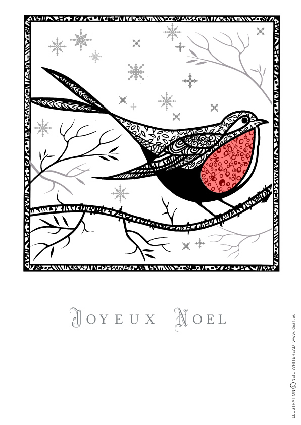
I thought that I would explore the world of mono and started with my Christmas card of a robin.I know there is a bit of red in there so it's stricktly a duotone. Before I start a painting, I sketch out the layout in tones of grey to get the balances of the masses correct. Also working with a restricted palette coan make you see and interperet a subject in a different way.

Coming over all nostalgic! Zipatone even!
Interesting thought Neil, that in our earlier years in the profession, we would have learned the skills ofgetting the best from mono-working in the areas of print and photography.
And yet, now colour prints are much cheaper than black and white, and when placing print, you may as well use Full Colour litho, or Digital, which, in most cases works out cheaper than spot colours.
In more recent years, we used to employ a bit of a trick, ie buy Full Colour space for say, a Double Page Spread, but run a B/W ad with a solid 'Yellow' from the CYMK ( printer's inks ) set, underneath, it gave a very, very rich black indeed.
Ah, the smell of the print!!
Ron
