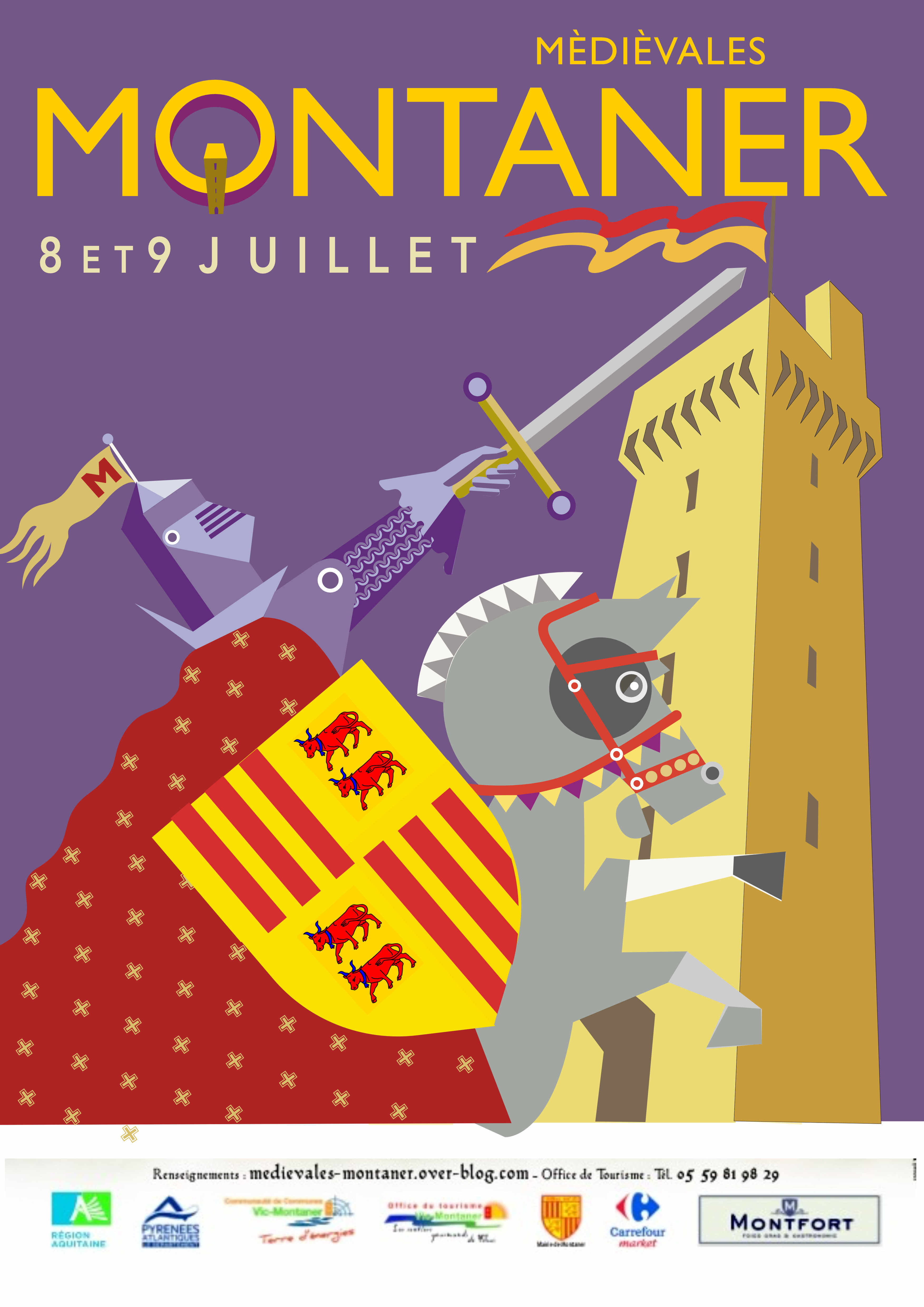
Each year there is a large medieval fayre with jousting, music and general revelry in a hill top castle at Montaner near Vic en Bigorre. (Les Médiévales de Montaner). The organisers run a poster competition and I have designed two posters but which one should I choose?
1 Like
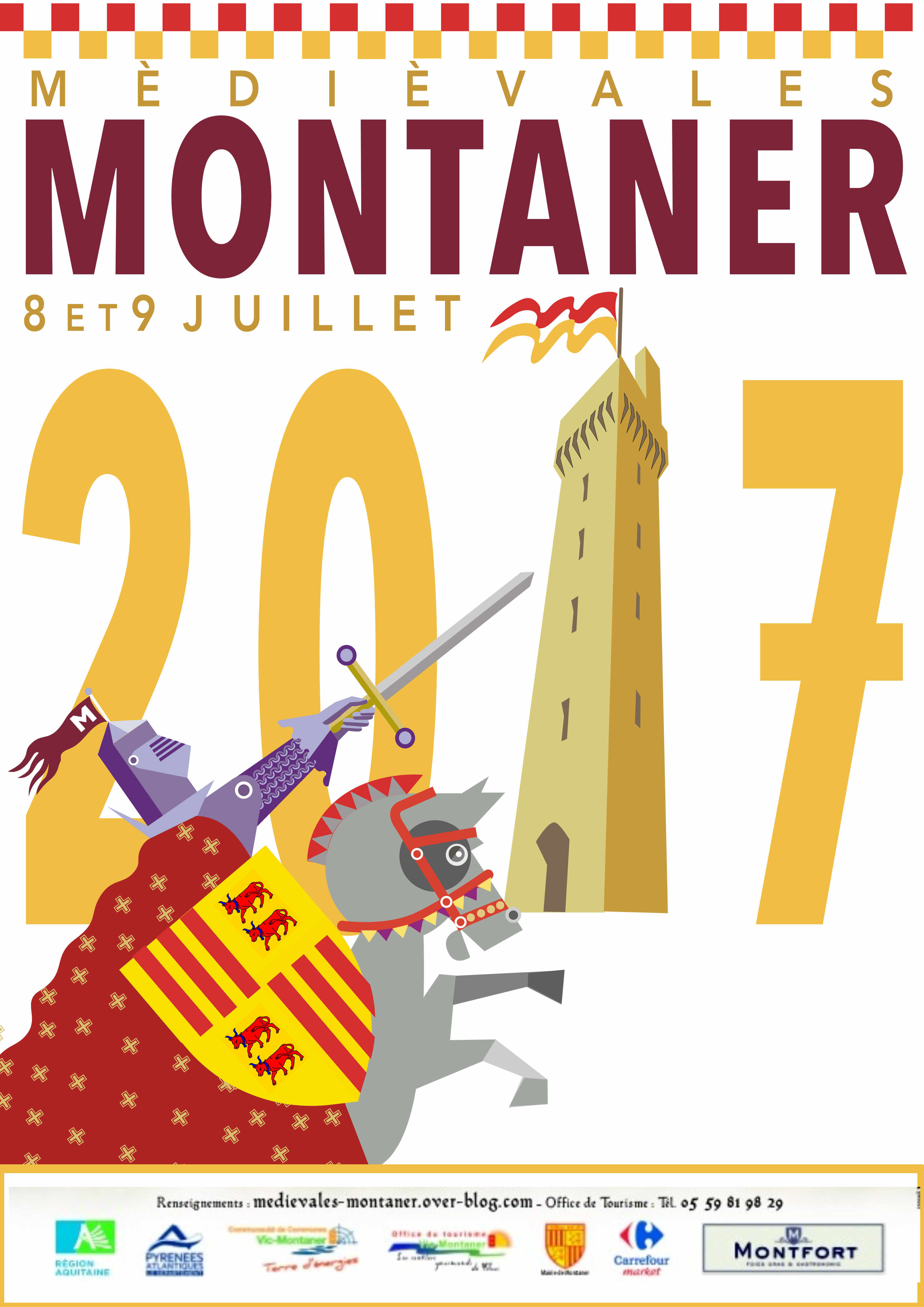
I prefer the second one.
First one, definitely. There is movement in it.
They’re both impressive. The lower one cleverly incorporates the year and I presume this is important in publicising a future event? On that basis I would suggest the lower one is more likely to succeed. Bon courage!
Thanks for the comments - some tweaking to be done re putting the year on the first! Opinion seems to be in favour of no. 1.
The top one Neil. Very nice 
Thanks, submitting by friday.
The first one, more eyecatching and therefore attention grabbing, good luck
Yep - 1st one much clearer.
The first one is the more striking and will attract more attention.
Is the date that important, are last year’s posters still up?
Thanks . I’ve sent in the first one with the full date on and there are a few posters still around!
First one, but it will be more expensive to print-more colour, but more impact and bangs the message.
The 1st one
More to the point. good plug,
I’ve marked it in the Diary. and hopefully will be there.
Hi Neil,
Too late to make a difference, but the first one would work best. The colours sing out. I love the detail of the tower on the O. White backgrounds get lost among the other communication and when posted on the web, you lose the edge as most page backgrounds are white. Bravo. I hope you win, French taste for graphic design is not as sublime as the days of Lautrec.
Perry
Thanks Perry. Number 1 has been submitted.
Again, this is too late, but the first one.
I’ve been running major international historical re-enactments (from single period like this to multi period from Romans to WW2) for more than 10 years and have had to design and/or approve dozens of posters.
You require something which is not too busy, which lets you know at a glance what it is, and stands out if at the roadside or in a shop window alike.
Maybe I should polish my maille and come down to check your event out!
If you use a black or dark blue background it is more visible for people with a sight impairment. Just a note for next time.