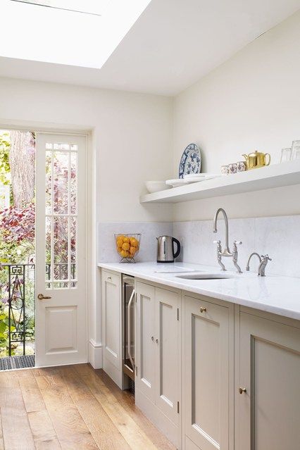
I do not know what your floor is? I think it best in a small space to keep the walls the same colour, or slight tone change, as the cabinets. Not too ‘busy’.
Colours are subjective. Take care with blue and green because the light spectrum cast can create a rather sad atmosphere. You won’t know from a sample, until the whole room is done and feels….
That said, there are some lovely shades of green and pale blue and white can be crisp and nautical. Grey is probably best in a warm tone for a small kitchen. Warm grey cabinets with ivory walls can be lovely.
Just remember to tie in with the rest of the house, architecture and furnishing style wise
Just in case any members are thinking I am a design bossy boots telling Tory what to do… I am just giving advice to the best of my abilities for a valued SF member.
For what it’s worth knowing, I trained and worked for four years with David Hicks in London in the ‘80s. I continued working as interior designer at an international company in Hong Kong, Singapore and Jakarta, later turning to other priorities but I still have the memory of an elephant, and design principles are embedded even if I vaguely keep up with technical innovations.
I worked for a time in a studio where there were two permenent kitchen fettling guys. The studio didn’t get in a new kitchen every time there was a shot of some kitchen product, they changed the colour of the units. This was done by spray painting. The range of paints for spraying is vast. They used celullose [I think] for cars.
Not at all!!! I would be happy if you told me exactly what to do I´ll try to get some more pics.
Floor is currently a pale fake terracotta colour. Our new tiles are grey / cream toned fake wood type ones, who knows when they´ll get put down though! The kitchen may even get changed eventually but want to get it lokoing a bit nicer as no doubt it will be years away if ever!!
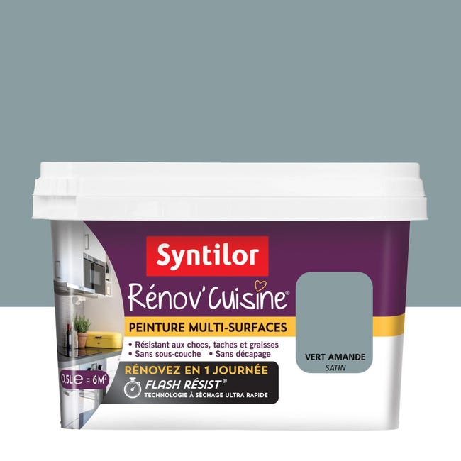
This is the tester pot that we have, don´t think I´ve posted it
Respect! Boss on! It’s you who would have been doing the swearing when coming to a studio to see the results of a week building a kitchen set for then then innovative ‘any colour you like as long as it’s not cream’ AGAs.
The art director ushered the advertising manager of AGA into the studio. We all waited with baited breath for the Golden Squeal Of Approval.
The kitchen was a ‘trad’ farmhouse kitchen with - ummm - oak cabinets, scrubbed pine table, wicker baskets of eggs, dangling bunches of died herbs - you know the sort of thing.
“THIS”, thundered the AGA man, “IS EXACTLY WHAT WE HAVE BEEN TRYING TO GET AWAY FROM!”
He didn’t bother to take his coat off. He just walked out, followed by a now trembling art director, the person responsable for briefing the photographer on wht to build.
The photographer, a preturnaturally calm fellow, remained seated for some minutes, then quietly said, “OK guys. Break this down and await further instructions. I’m off to the agency to find out what they really want.”
Thanks for posting pics of this, that was exactly what I´d thought of doing. We even wondered if we could cut off the fussy bits at the end but mind them less in black that the nasty fake metal colour they are.
Ha! Ha! Ha! Happy memories. At least, I hope, you were still paid.
I understand that AGA was trying to get into contemporary kitchens and away from the profitable traditional ‘country’ look with which it had long been associated. I think they’ve finally been successful in that.
I did work on a few commercial shoots, one of which was a vibrant yellow creation by Mr Hicks for the TV program Room for Change. It looked good on TV but I really was surprised the owners were happy with the road line yellow in which they had then to live.
That was another thing about David Hicks, he could charm, and insult, even the titled into tittering adoration. I was in awe. Even when I watched him surreptitiously drop his Nicorette into the client’s Ming vase on a design briefing visit.
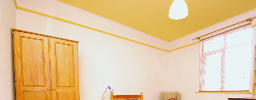
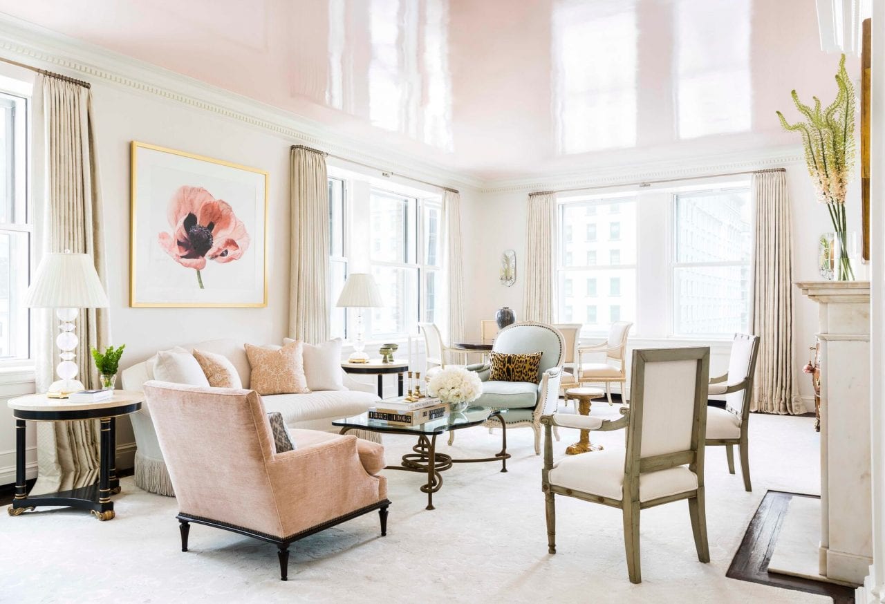
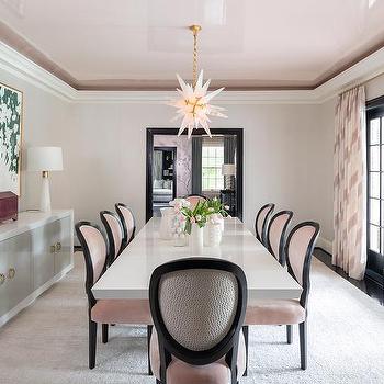
Just my man. I’m a fan of ‘vibrant yellow’ but not on all and every surface. I like it on the ceiling with white walls. It gives a sunshiny, Mediterranean effect, which is important to me, living in Normandy [Farrow and Ball actually have a tone ‘Normandy Grey’]
I once did yellow walls and a white ceiling. Every time I walked past that room I thought I’d left the lights on!
The yellow has to be good and solid, not a vapourous English pale number.
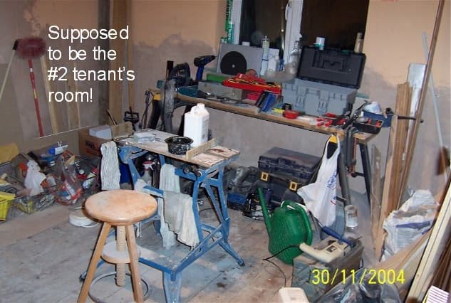
This room, for a lodger, faces north and never gets any sun, so the yellow goes a long way to giving it a bit of warmth. Plus the picture rail detail …
I can’t show the bottom half. That has the late mum’s brown sheets!
That room didn’t always look like that. For a long time it looked like this
We’ve noticed this years fashion in kitchens is a deep blue colour. Does actually look nice in the couple of new kitches we’ve seen, but we really wanted to lighten a dark corner. Carefully placed lighting can really help too, although @corona may give you a hard time if you don’t select the light units he approves of.
A deep blue is best if it is high gloss, spray application. Will help light bounce. However, for a small space it is best avoided, unless you enjoy claustrophobia.
Noooo! You are sweet. I just offer help for friends these days. I managed to sort out a new kitchen for a friend in Valencia, by visiting marble suppliers here in France. She would call me with her builder on site and translate. I could hear him laughing. Especially when she kept saying “How much extra is this going to cost?”
A friend associated with Pink Floyd told me that David Gilmour had a ceiling [maybe the walls - I don’t know] painted black. The painters had to do it like R.R and others do cars - rub back the coat until it is virtually all gone, re-paint, re-rub, re-paint, re-rub - building up the paint in the pores of the surface until the end result is like glass.
You have to have the money to speculate on the spot market in oil to afford that sort of thing.
True. Automotive spray is the way. A bit easier if you take kitchen cabinet doors off first. I had a few apartment doors done this way in Hong Kong. Ends like black lacquer. Ceilings cannot, so very neck aching.
Black reflective ceiling is a bit kinky (no surprise) but an off white one is quite often used with a low ceiling. Especially in a dining room. Way too kinky for a bedroom. But then again, you pays y’r money and makes y’r choices!
Speaking of black shiny, in Hong Kong where marble floors are loved, I often had to talk clients out of using Belgian Black marble. It reflects up ladies dresses!
When I was little the nuns forbid us to black patent shoes because the boys might see our knicks.