course your pretty...pretty annoying!
only joking, your beautiful!
course your pretty...pretty annoying!
only joking, your beautiful!
Hello all, I have finally worked out how to copy and flow 'text' matter from say, a website, a Word doc or any text for that matter, into the Application that I am using to prepare the Artworks for the publication. This will make production much quicker.... and less of a chore for those who are simply too busy to re-write and submit material.
As I am preparing these spreads, I am taking the opportunity to address suggestions en route. For example James's preference regarding the SFN motif as shown below. I am proffering the suggestion that we prefix the title ( and Masthead ) with the acronym SFN as it does have a status established on the net.
Susan and Ian's notes I have taken on board and I have those amendments in hand. Sheila's lead article will now be easier to put together with my 'text' handling method, the mechanics of which I shall not bore you with.
I have a suggestion myself which is probably more geared towards James and Catherine which is as follows. We do have the facility to insert per artist various details such as address phone, email, web site, hypertext-links etc.... but I feel that is a 'one way' direction. I think we should list the artists in a Glossary, have a Frontispiece which describes not just the SFN Art Department but SFN itself. I can put a link straight through to 'SFN' Members, where there already is a 'search facility' in place. Any interested party can find the artist, and from there, their links to websites and Blogs etc.
At least that way our efforts aren't evaporating, the artists still get their interest, and en-route the 'new' visitors have a chance to see what SFN is all about including the many other Groups on offer, a route to the respective FaceBook Pages, and may even 'join' up, which I'm sure is good for everyone.
Perhaps this is something I should have floated past the other Admins first, but I am mindful of the fact that James and Catharine are very busy, Neil is snowed under at present and Sheila too ( much like myself ) is juggling projects. This is the case right now and will continue to be so, I don't think we can afford luxury of too much carbon coping, protocols, online meetings etc. As the project develops a methodology will ensue, we are all working to the same end, and are, after all, volunteers.
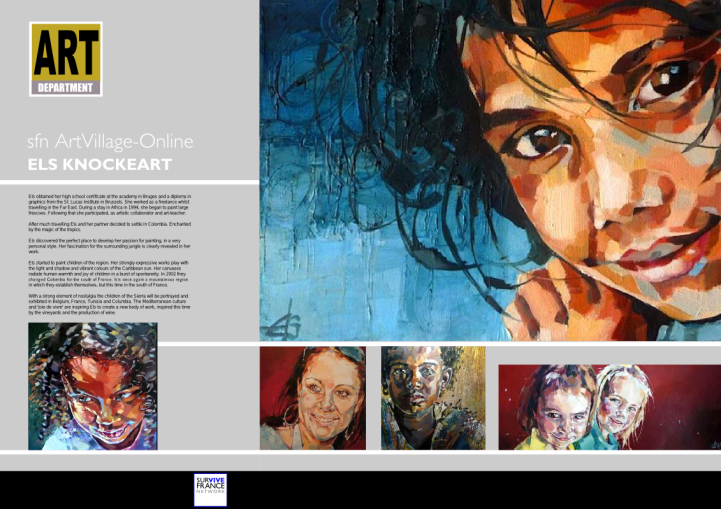
The spread featured today covers Els Knockeart a wonderful local painter who's biography is most interesting, her details are available on her profile at SFN. I am working closely with Sheila to carve out a workable 'selection' process which we aim to publish in these pages, very shortly. It is our intention to produce a fresh 'proof' page or spread daily, so please keep visiting and offering your comments. Thank you.
Ron Birks
for and on behalf of the Art Department.
don't worry its our new wallpaper. Thinking about taking the bum print global.
he never tells me i 'm pretty, but the mag looks good.
Hi,
I am in receipt of Sheila's Opening Article...( thank you ) but I am having trouble flowing the text matter into a page, something wrong with the App. Whilst I am trying to sort that out I am laying out several spreads for the likes of Art Department members such as Els Knockeart and a few others.
Hi All,
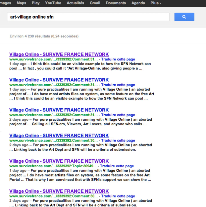
James has very kindly approved the project and is happy with the attention given to the SFN Brand Umbrella... but would prefer the 'cleaner' text based Icon that we all know. I have done a test on the keyword out-come and have deduce that 'SFN Arts Village Online' has more 'cache' effect i.e. is a the top of the rankings, whereas just Arts Village is too overused. See below:
a problem with my descriptive text???? ...look I'm the pictures guy.
ha ha no trawling..it's just that the computer is such a mess... I have about 150 gigs to back up!! I think we are under control...Sheila has just done a lead story I think... I'll be back.
Thanks Susan x
All sounds under control. Just to clarify, you haven't cropped anything out of Ians paintings so far (it was one that I attached that I was referring that had the red at the bottom). I don't want you trawling through photos looking for something thats not there. Shout if you need me to do anything - my time is limited over the many bank holidays and pont days next month but happy to do help if needed.
Bon appetite
I will work on a translation.
Ok very funny - but can you please post a "how to" (maybe Sheila could if it is not too much to ask?) for those who might not 'get' it. Thanks.
Hi Susan, Thanks again for your comments, and I appreciate your attention to detail... and worry not about workload as I think the fine tuning is what will make this top notch, at least as much as one can in screen format.
My desk top's chocca at the moment so I'll shall have to back track once tidied and I'll see if have cropped anything I shouldn't have. I am using Ian's work as a test bed to hone the template, so this is all very handy.
The beauty of this 'online' format is that one can ( once it's up ) rotate, amend, add pages etc. so there's no reason why we can't have 4-6 page sections, and as everything is screen resolution the files I have are fine.
So if I drag a .png file off of the Art Dept Gallery, they are about 250 kbs... so I re -save the pics which which bumps each file up to about half a meg. which is quite usable... but I will keep you posted on that.
The final artworks are uploaded to the 'publisher's' site in PDF format..and the 'final 'screen' Mag is 'page-viewable, 'zoomable', outlinkable and one can 'flick' through the pages 'electronically'. The whole piece can also be downloaded, but what the final printed output 'quality' is like then I'm not sure'.
On the point of the greys you mention, the bottom grey is a Pantone Solid Black , which will look different on each screen, subject to how the monitor is set up.
I'm pretty sure that once we are underway the final artworks can be done fairly quickly, so I am even debating whether to bother with page folios ( numbering ) as one has control of page order using the 'control panel', and I guess we will be adding, subtracting etc.
When Neil and I discussed the project in January, a fresh publication was the idea, published each month, that may prove quite time consuming, in the end...so it may be that we have a 'core' 'Book' and ring the changes monthly with new articles, Front Pages and 'Spotlight on' type of things.. leaving the core material in tact.
Have to be realistic here..the items aren't for sale, and there will be new readers all the time as a following can is built up if we band together and help market the device.
Tea time.
Laters
Ron
Well done, it looks great. I've just spoken to Ian about this and we wondered whether dark grey might be better as a border at the bottom which would work nicely with the light grey and not affect the painting. We certainly don't want to add to the workload of doing this so if you think thats a bad idea thats OK and maybe we could change the painting as it is unfortunate that the painting is black at the bottom - he only has a few like that. I am hoping I have attached a couple of other square paintings as suggestions if you wanted to keep the black. Not sure if I'm solving anything with the red but it does have a red splodge (technical term!!) at the bottom. Also, before I forget, Ian asked if you need any photos in high res,
Dawnie... this isn't a chat line... why not Skype Michelle? be nice to see more of you!
I just don't want my bottom plastered all over the place
Dawn. I always wear a top!!! and I have said, for artists we don't see nudity only the inner person.
don't be silly....and don't you dare publish any paintings you have done of me naked!!!
so are you sister-in-law!