oooh that's pretty.
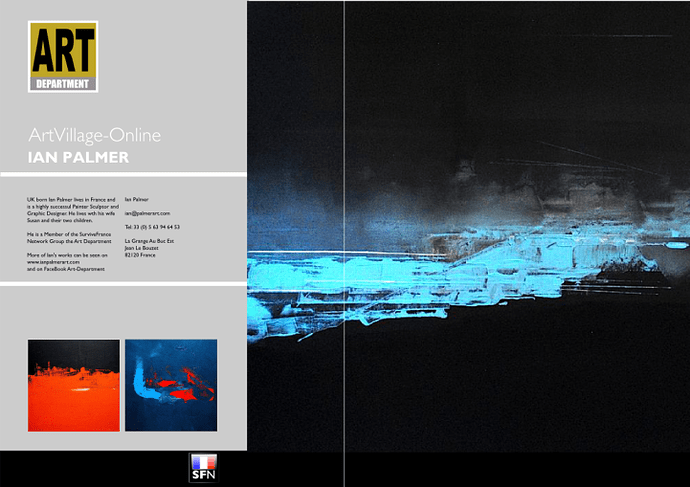
Phew....it's taken the Studio most of the day.. but having utilised some pics from Ian Palmer's Gallery, we have established a workable 'Grid system'. The original Paintings here are square in format so a Large DPS won't work. In this instance the bottom black strip does affect the dynamic of the painting on the right. Whether one can live with that...or we change the colour of the strip is really for Ian to decide. Personally I am loathe to put in too many Borders, keylines etc...as I feel this will detract from the important elements...namely the artworks. Copyright notices, references to SFN's URL etc are open to suggestion.
I personally also think that for the 'Focus on' articles these should be free of too much glowing text matter, as the creativity speaks for itself. We are inviting comments.
If this does prove to be a workable template then the rest of the works for the launch issue should be easier to assemble. Ha!
Hi Susan, I am normally agin' 'design by committee' but I am finding these comments both helpful and encouraging..as I have mentioned, we are keen to do justice to the sheer quality and professionalism we can boast amongst our Membership... keep those comments coming in.
I can't wait to finish a Double Page Spread, that is gonna be stylish..
Good point Helen....
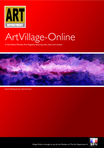
I really like this logo - simple and stylish. The purple against the red works really well and I really love the front cover that you have done for Henrys painting.
Yes, you need to have Art in the heading otherwise it could be just be about the price of fruit and veg at the local market.
Good Morning SFN-sters,
Whilst you have been do-dos the Studio has been 'issie wizzy let's get busy' tweaking and fine tuning the Arts Mag cover. We have made a few mods which will be apparent, ie I have simplified the 'Art Department' logo, so I will need clearance from Neil on that, and have also taken Jon Lisle-Summers' painting to see if this format will sit comfortably with a 'bleeding off the page' resolve when it come Landscape pieces.
I do know that this morning Sheila will be slaving over a melted PC and tapping out the lead article for issue one. We are working on a DPS 'layout' style which is taking on a more of a Gallery Catalogue style ( lots of white space rather than the busier 'Gadget Mag' type of thing ) hopefully that will be online for discussion later on today.
That would certainly work Sheila.. Art-Village-Online is a sound idea, as you say it is 'descriptive' ( and less YMCA! ) plus when we get on the Blog-train ( as we will team? ) There are three valid KEYWORDS to keep those ( what was it dystentery ridden Spiders happy. lol
Also the Art Village element smacks of an Artists Commune V. French and very Community spirited ...which we are ... feel the love
Good idea Ron. Re the title, what about moving the logo to left and move the title alongside. In fact, you could call it "Art Village-Online, also giving people a cllue to what it is about.
Ah! the Muse... get you. all artsy fa....
love the colours
Very nice, can't wait to see the rest
Hi Sheila, I think I'll move the second line of heading text up....and when it comes to monthly covers changes we will pay attention to backgrounds and request input from the artists.
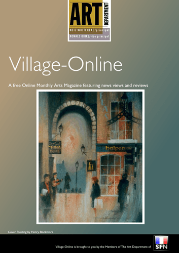
You will see that the 'Portait' Merchant's Arch Dublin does not lend itself to 'bleeding' off the page...so by thickening the border to 2.5 mm we can accommodate most formats. Re the background I have used the Pipette and echoed Henry's colours...Although black I think would look extremely sexy...
Excellent, Ron. Love it. Henry is very pleased. Think the muted background idea works very well too. Will slave over hot keyboard tomorrow, post-shopping.
S.
Thank you Helen, much appreciated. I think you are right I can envisage a whole 12 months worth of 'front covers' all in keeping but suitably bespoke....we are excited about the project.
Well done Neil & Ron and to all your helpers. Great idea. I take my hat off to you for all the work you are putting in to this project. Your front page looks good and I wouldn't worry too much about your colour schemes. Take for example the french magazine AD, they have a standard layout but change the colour to suit the front page photograph. Personally I think colour is more attractive than white. Keep us posted!
No problem. Go ahead.


