I've moved the chat window for a number of reasons, one of them being the time it takes the page to load. It hasn't disappeared entirely though. You can still access the chat window from the bottom of any page on SFN. Upcoming improvements may see it back on the main page, in the meantime though I'm going to show you how you can place the chat window anywhere you like on your desktop!
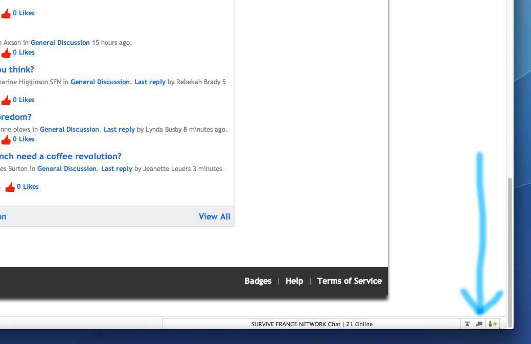
It's really easy to do, click the middle of the three icons at the bottom right hand side of the page, (you should be able to see it now) do it now, it won't affect this page or anything else.
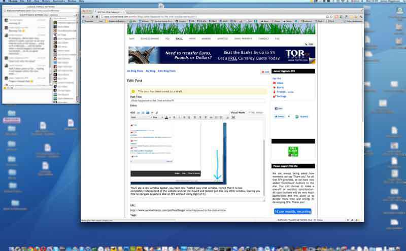
You'll see a new window appear, you have now 'floated' your chat window. Notice that it is now completely independent of the website and can me moved and resized just like any other window, leaving you free to navigate anywhere else on SFN without losing sight of it. (You don't even need to stay on the SFN website at this point, provided that keep your browser open the chat window will remain indefinitely.
1. The header image could be made smaller, I liked the photos too but we needed a more cohesive design across the various platforms, Facebook, Twitter etc so that's why we stopped doing that. I'm not a fan of the current image though, I would like to talk to you about that too, it needs a complete revamp, but it means changing a good few other graphics to keep them in harmony.
2. I'll have a look at making the tabs more prominent. What big grey panel?
3. Agreed the chat needs to be much more visible. I actually preferred the chat where it was embedded in the main page, it was slow to load though.
6. Not sure what you mean about down the order? I can't choose to only display the photo images, but we could change the icon for something else, we used to have a box saying, awaiting photo, any suggestions on what we could replace it with?
Just a few thoughts re the site. Not so long ago we were buying bigger screens as they get cheaper and cheaper. Now with laptops and tablets getting cheaper as well, screens are smaller again.
1. The large SFN panel at the top is a bit irrevelant. When you are on the site you know where you are. Liked it when different photos were used each week. Don't like the big ad on the top.
2. Buttons at top - main, business, etc. a bit more prominent or on colour panels. The big grey panel is not required and can be replaced by text on the left.
3. Larger chat window link at the top-one reason we are on the site is direct communication.
4. Survive on Facebook panel lower on page. Ads at the top.
5. On the left, more groups in the list-would it be possible to have 'my' groups listed first?
6. Move members pics down the order and only show pics, no empty blue SFN boxes.
7. Keep all info on ads on the right and personal info on left
I have to say James, as I use a lot of IM tools like gtalk and yahoo, this is much better for me like this, and the SFN main page loads so much quicker, which is great. I might investigate to see if their is a plugin for the ning network with Pidgin or Atrium.
Richard, that's a very good choice of browser, can you please try zooming out to see if the chat bar at the bottom becomes visible? It's in the view menu, sorry about that. Failing that a screen shot would help me diagnose the problem better if possible?
Not being a particularly sociable bunny I think I only 'chatted' once or twice, so for me the faster loading is a bonus. We don't have the fastest internet (and I use an old machine) and anything with a live feed incl Twitter and the new Facebook (grrr) really slow everything down.
I like the floating window changes. Good idea. Would suggest larger icons at bottom of screen and when you mouse-over, show the user "Open Chat Window Thingy". :-))
As I am shite with computers it took me ages to even understand how to find the chat window again (don’t tell Nick, he’ll just lecture me… and roll his eyes…). So, i found it=result, then I scroll down the main page and it’s gone again I don’t use it often, love to read the chats though and have replied to questions through the chat window. As James says we’ll get used to it, but it was nice when it was just there. Sorry, but you asked for comments.
Good idea James, though I think you should make it more prominent such as a panel to one side though the intro page is starting to look a bit cluttered.
 although there may be some for whom it is an improvement…and before you say it I am not aiming that towards ANYONE!!!
 I don’t use it often, love to read the chats though and have replied to questions through the chat window. As James says we’ll get used to it, but it was nice when it was just there. Sorry, but you asked for comments.