Well, let’s see how we go - fingers crossed and all that!
It may seem strange to talk about ‘Learning from commercial art’, as others have said before Commercial Art has never been regarded as ‘proper art’ in many circles. Yet it is the Art that we are most exposed to every day of our lives. From packaging to posters, from brochures to magazines, postcards to postage stamps, and even the humble letterhead or business card to the most elaborate crests and signage. From Truck sides to restaurant menus, from Holiday brochures to book matches, from logos, pictogramms and emojis - the list is endless.
When you read a sign, or a direction of a newspaper, or even TV commercials. Commercial Art is there. So why shouldn’t we learn from these things as much as other forms of Art?
Commercial Art is merely art that has been prepared for a product purpose and paid for. Most if not all Fine Artists were in fact ‘commercial’ in one way or another. We have all been hired to produce something for someone else and get paid for it. Picasso, Renoir, Toulouse-Lautrec, Degas and others all produced works that were ‘commercial’. Theophile Steinlen, and a host of others may not be so well-known by name, but their works are recognisable by almost everyone.
Commercial Art is of course very much part of Marketing and Advertising. In the not so distant past Illustration was a BIG part of Commercial Art. Naturally the same can be said of Copywriters - those who write the words for the advertisements we see for just about everything. Almost every day we open our letterboxes to brochures from Supermarkets, and local retailers. Sales Promotions are an arm of Commercial Art. We mostly say we ‘hate the stuff’, or ‘I never look at the trash’, but that is simply not true. The evidence is the mere fact tha we still keep getting them, and in an industry that makes a point about not wasting money that speaks for itself. We DO read them, We DO react to them, we DO note the Specials and a great many create their weekly shopping lists from them.
We all hate the posters that line the routes, highways and byways. Many despise the ‘visual pollution’ of neon signs etc;, etc - until we want to find somewhere, or visit a city. Of course there is rubbish and poor quality, but we cannot deny that Commercial Art resonates with us on a daily basis.
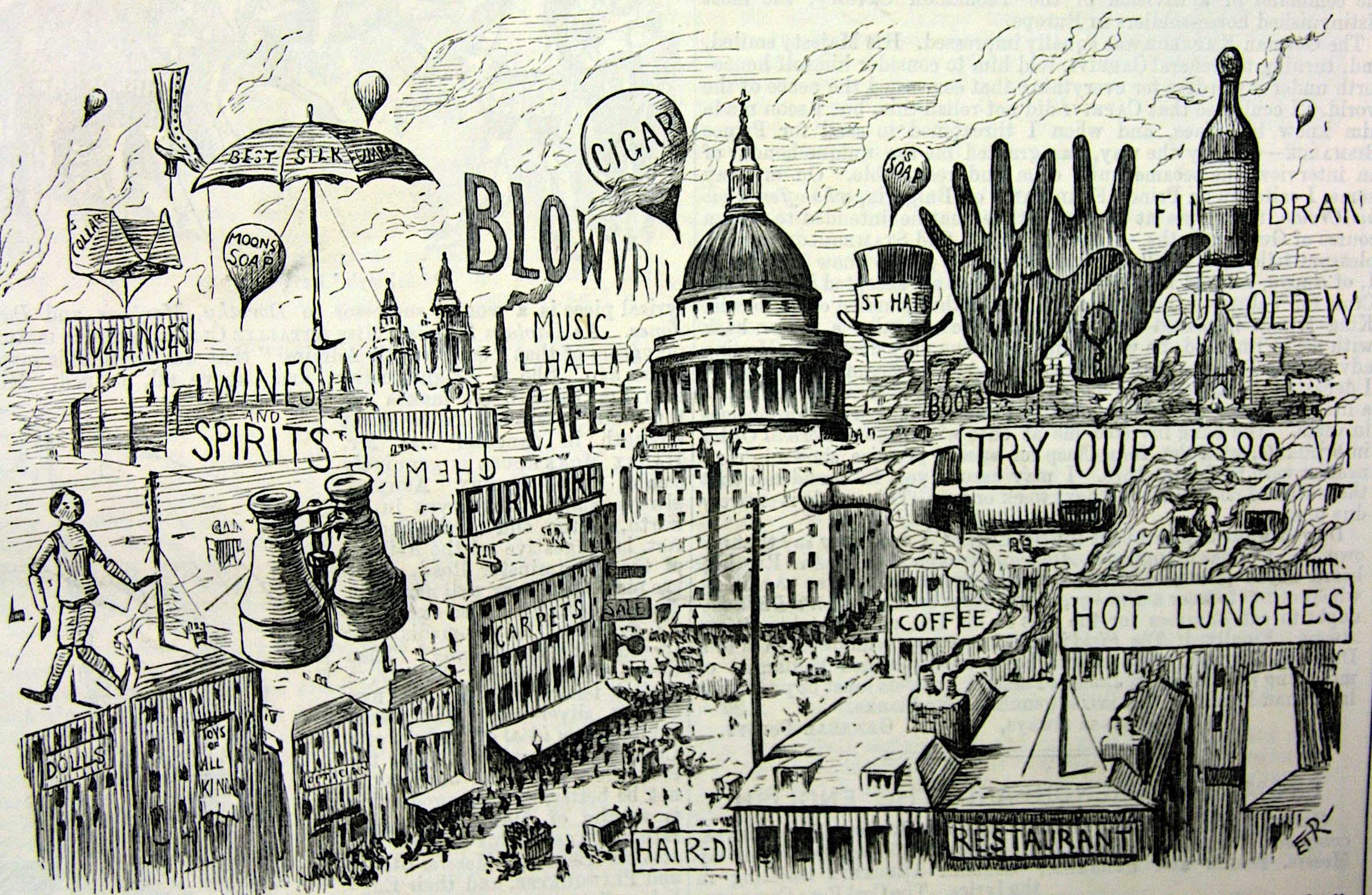
It may come as a surprise that the average City Dweller is exposed to something like 5-8,000 advertising messages each and every day! On a 24 hour day that makes 333 messages every hour, or almost 6 messages every minute.
we know our average attention span is between 8-10 seconds.
Check this out for yourselves - it is an interesting experiment. Try to just look at something directly for ten seconds without moving your eyes or head away from the image - even IF that image is moving as with a ‘talking head’ Look at a TV Commercial, or Film time the changes of direction of the cameras (editing). You may be surprised.
Now think about those things that cannot be edited as they are static, usually printed materials. Our attention span remains the same, so how do we work with this?
This is where the skill of Commercial Artists come in. They create ‘movement’ where none exists in reality. We get the observer’s eyes to do the movement for us.
There are a few little guidelines that we use, and the most popular one is called AIDA - yes just like the opera, but Different. We use these letters to provide a structure for a piece of Commercial Art. A- Attract (the attention, I- Inform and Interest, D- create the Desire for the product, and A- get Action (o buy).
Note the sequence.
Beyond this we get into all the Motivational bits which are really outside the scope of this topic. I created a Focus Form which I called the 'Magic Questions - What? Why? Who? Where? When? and How? all part of the process.
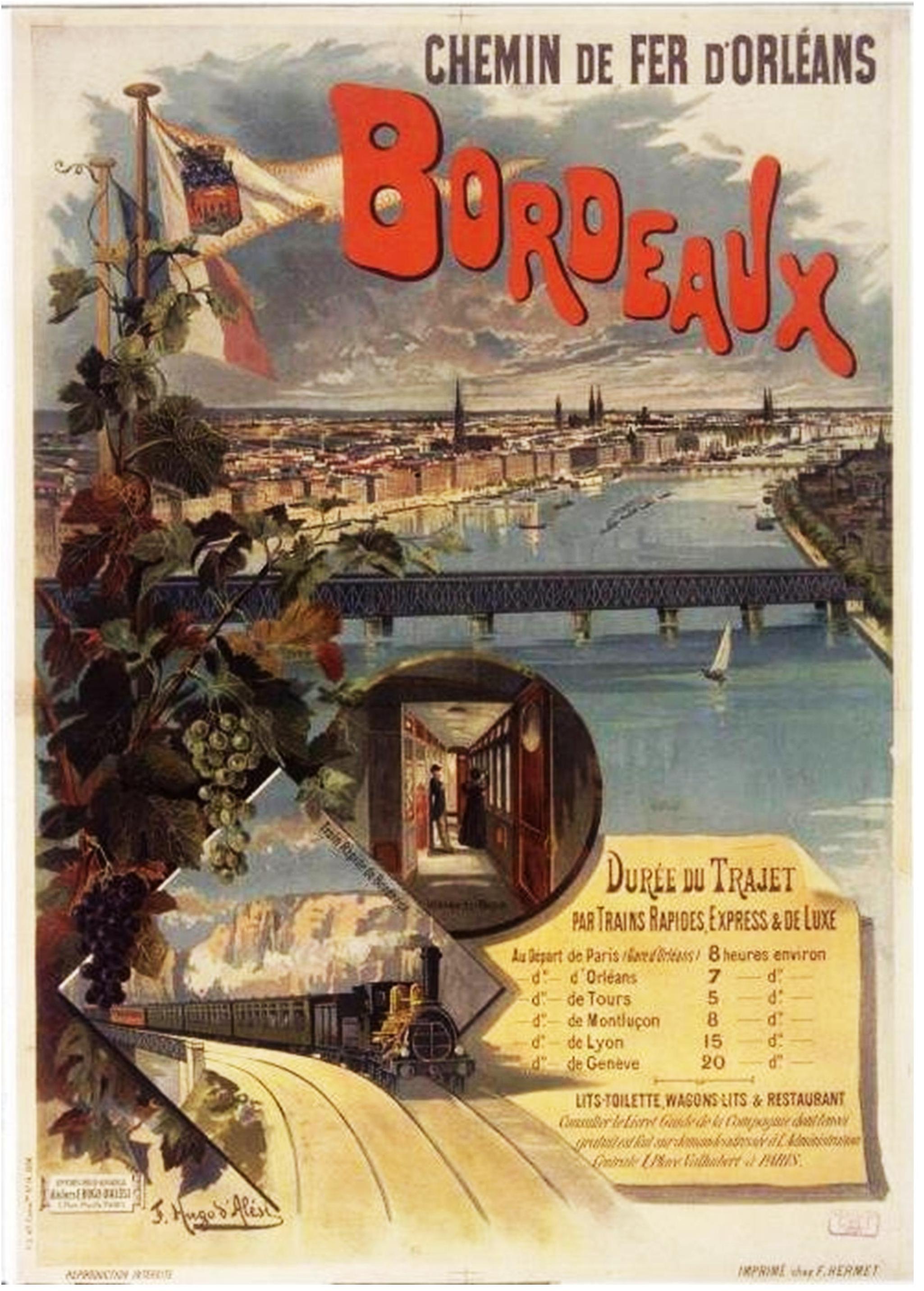
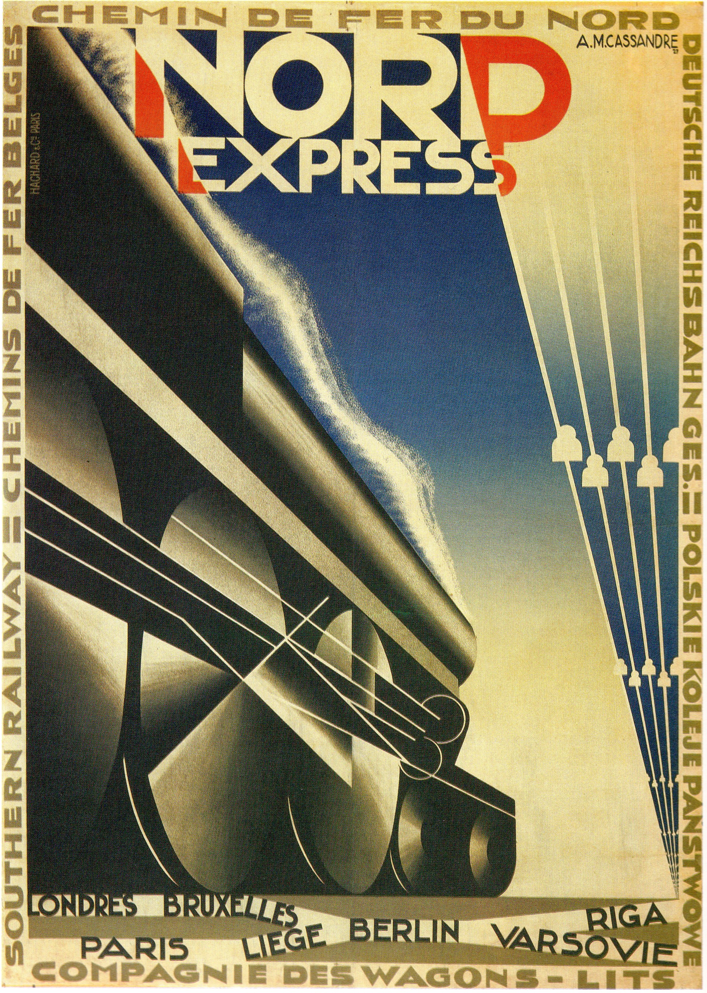
I intend in this blog to concentrate on Poster Designs over the period of 1850-1950. Why?
The dates are not arbitrary, they cover the period where Posters as a Commercial Art form were created mainly by hand - at least the Art was. No computers, and almost no photography for the first 50 years. The Illustrator was important - hugely so, but the Designer even more so. He or she 'constructed the whole image/work, and decided which techniques could best serve the story or presentation (the sales pitch).
We need to consider one other aspect about Posters. Most media at these times was designed to be taken with the reader - newspapers, leaflets, brochures etc. It was mobile for the educated. But even though to the early 1920s the average person was not that literate.
Most responded to ‘pictures’ and what we now call Pictograms.
The obvious ones are the signage on shops and stores - Hairdressers had their red white an d blues stripe poles, and or Scissors and Combs for imagery, the Baker showed Bread, the Butcher and animal’s head. Boxes would and still use ‘Up and Down arrows’ or a broken wine glass to depict fragility. The list is endless, but even the most illiterate could understand what it meant. Wonderfully they usually worked across linguistic divides as a bonus.
By the 1850s we were seeing rapid improvements in printing techniques meaning more posters could be produced quickly and cheaply albeit still usually in single colour and just words. Technological advances came thick and fast in the mid-to late 19th century, not least of which in printing. I will not digress into paper at this time as there was little option to the cheaper and coarser types until into the 20th Century. Art for Art’s sake was expensive to produce, and it wasn’t until the Impressionists and the slightly earlier Nabi Art Movements experimented with other surfaces. Toulouse-Lautrec with card and Kraft paper being a good example. We will revisit this area in later blogs.
My intention will be to relate Commercial Art to the times in which they appeared. This may cause a little confusion as although almost ALL art was produced with some commercial intent we see the abstraction of time being equated to an Art Style. We talk about the Belle Epoch as the era of Art Nouveau, and Art Deco as the Roaring Twenties era, but we don’t do the reverse. Later as with the Austrian Recessionists and even the Impressionists, these démarcations became confused.
It has been necessary to introduce the subject in this way and lay out a bit of a map for what is to follow
Stay tooned!!