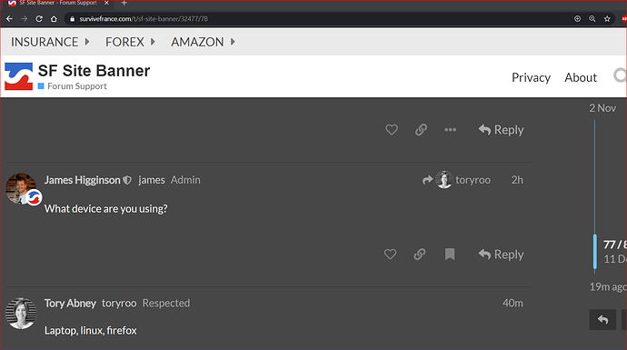
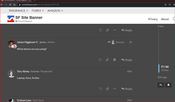
Have you tried to zoom in or out?
Yes, and I’m always going a million miles an hour so if I accidently go over the ‘insurance’ it then drops down the menuso the ‘fab French Insurance’ covers the little square and opens his site!
Not sure it will help as it is the drop down menu covering as I descibed above. It isn’t the end of the world, just annoying where it wasn’t before! And Iam getting better, only opened Fab’s site twice today ![]()
![]()
Good idea, only the right hand menus do not have sub headers, but i agree, it would be good to have.
OTOH, it could be added to About as a subheading there…

Maybe we should have a topic for site improvement suggestions? Public or in the lounge, whadddya think people??
They’ll get lost otherwise
Personally, I think it’s fine as it is. A new topic will still disappear down the plug hole over time anyway unless pinned somehow in the About section.
But, if you must… public would be best so new users can add their two-tuppence worth which might be answered simply by referring them to the feature they need already existing 
@james Noticed the new line up on the top banner…
shouldn’t Revolut and Transferwise go be linked under Forex (or a new Banking heading) to tidy things up?
Probably yes, revenue (or lack of it) trumps tidy though!
fair comment James - had to read that twice to work out what Trump had to do with it though 
Good stuff if you are now receiving referral € from Revolut - we certainly bang on enough about it.
Auto added apostrophy! Fixed it
I’m guessing moving it over a bit isn’t an option then? I’m still opening Fabs site numerous times a day 
Me too! Using mouse, not touch pad as well.

