I do think a non-log scale on Y axis would help demonstrate this better and avoid the confusion and perception of “its nearly finished”.
What would be the pros and cons of a scale that neither flattens the curve (as the log scale obviously does) nor turns it into an almost vertical line?
People struggle to understand that the rate of deaths is still very high when the line is flattening.
Pros? None that I can think of.
I see today’s figures are available- 5288 new cases is level but we might expect reporting to be slow over the weekend so perhaps cause to watch the data carefully next week. 737 deaths is almost certainly due to reporting lag over the holiday.
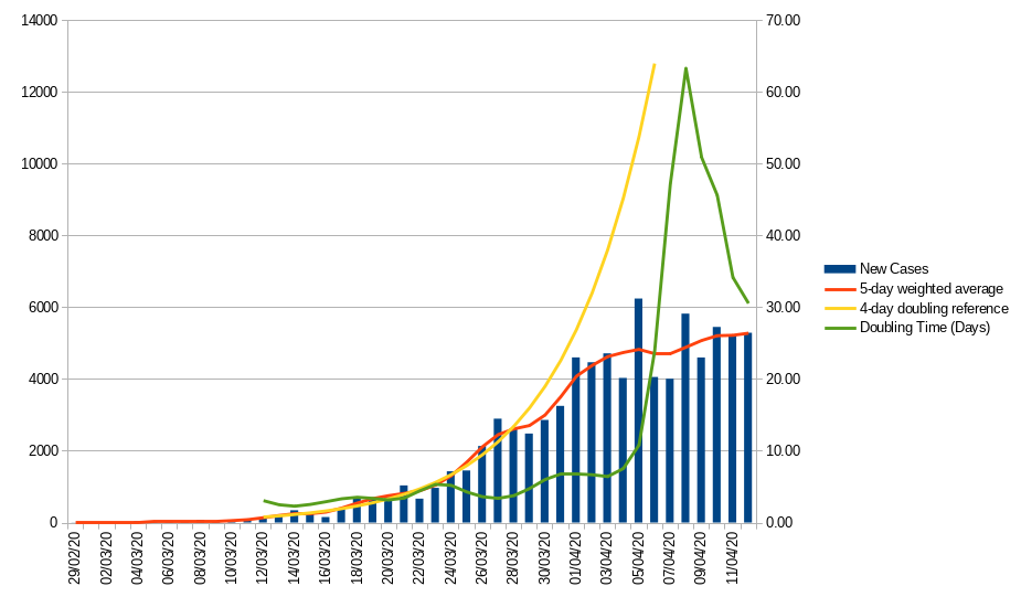
Here is today’s graph - at the risk of cluttering it I added another line which is the calculated doubling time for each day’s figures based on the number 5 days previously (using the averaged data) - it’s very sensitive to the numbers levelling off, as you can see.
Indeed, it seems no one in the mainstream media can be bothered to explain (or does not understand themselves) the idea that deaths lag new cases by ~ 2 weeks.
1 Like
With CV hospital deaths only being published and not those occurring in care homes or at home the real daily death figure is clearly much higher. I’m aware that the ONS issues weekly ‘death certificate’ numbers but will these figures actually find their way through so that an accurate death total from Covid-19 will emerge?
Eventually is probably the best answer.
Note all my graphs are linear scale
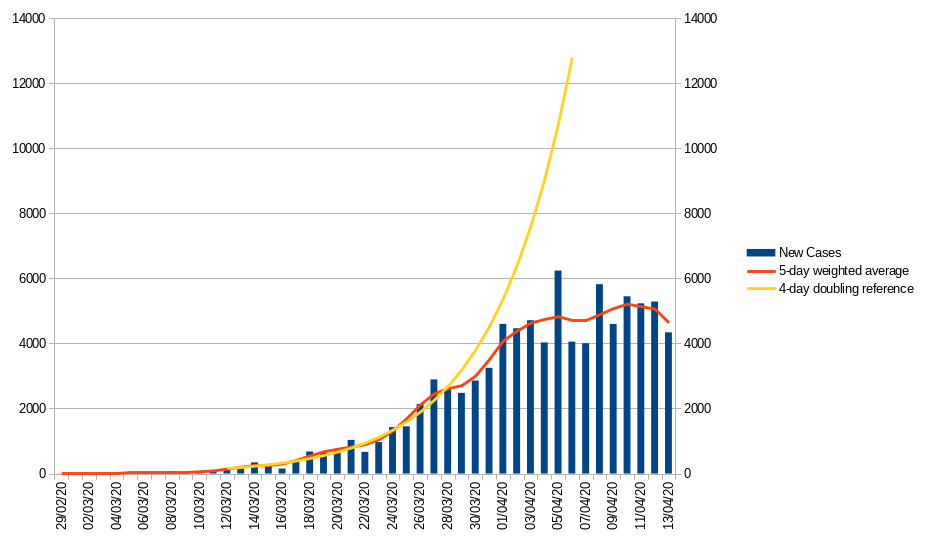
Talking of which - today’s update. Adding a weighted average does not add all that much to the view of the UK data on Worldometer and the big weakness remains the lack of historical correction for community cases. However the French reporting remains very variable so the smoothing brings out the overall trend which is very positive - though with the bank holiday weekend I’d wait for a few more day’s data before jumping to any conclusions.
UK
France
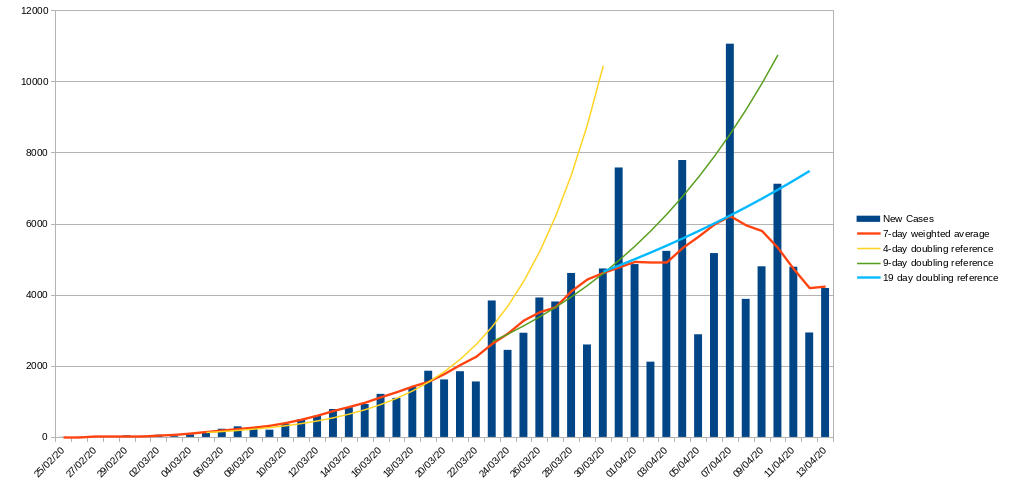
The error I accidentally introduced in the French data has been corrected but remember that there are still 17,827 cases (about 30% of the total prior to April 3rd) missing from this graph - as far as I can see no data has been produced as to which dates the extra cases fell which makes it a bit hard to know what to do with them. Worldometers has ben reporting combined figures since April 3 so the parts of this graph before and after this date are not really comparable.
So, by way of an experiment I distributed them proportionately through the data points up to and including the 3rd. The result is interesting.
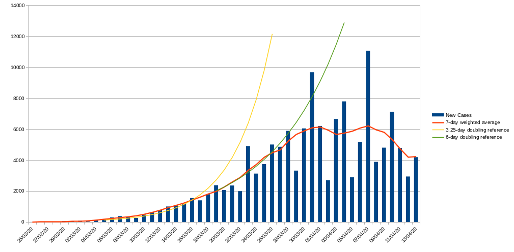
There are still multiple phases but they shift - the initial rise is probably faster, doubling every 3-3.5 days but then there is a definite drop down to doubling at a rate of approximately once every 6 days - but this seems to happen as lockdown was starting, too early for the lockdown to be the explanation.
There is then a second slowdown kicking in late March - around the 28th starting to level off at the beginning of April and then a definite decline for the past 6 days (but as above I’d wait for the rest of this week’s data before getting too hopeful).
I don’t know which is the better way of looking at the French data - neither is 100% given the sudden inclusion of such a large number of late reports on a single day.
2 Likes
but at least the President and the Govt of France are being honest with the people.
And just to skew the figures some more:
1 Like
An habitual liar from Untruthville (or should that be Menda city?) practising for the annual lying contest would still be more truthful than the Tories.
As for the data coming out of France vs the UK - I think the French figures are a bit more reliable but in truth, who knows?
5 Likes
Listening to Chris Whitty yesterday I felt he was being a bit evasive, he said the daily deaths figure is the ‘international standard’ (ie hospital deaths only) and the ONS figure which is the most accurate is freely available which of course it is but you have to find it it yourself on-line. France also doesn’t include the ‘died at home’ numbers in it’s daily reporting so it’s very difficult to know the true picture here either. Much has been made of the response to CV in Germany but even there it would seem as though the care home sector has also suffered badly -
They are reporting both
although it takes a bit of aritmentic to separate/combine them - the Worldometers figures are the combined totals of in-hospital and out of hospital cases so the graphs I have posted will be total cases for France and hospital cases for the UK so not directly comparable.
Thus the WHO concentrating on hospital cases as a metric which is broadly comparable between nations.
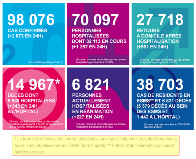
Think I understand, the 1442 is those that died at home?
Well, it says in hospital.
Worldometer is taking the sum of the top left and bottom right box as total cases and (I guess) the difference between today’s total deaths (bottom left box) and yesterday’s for new deaths on a given day (and then you can subtract the last 24 hours hospital deaths, also in the BL box, to get community deaths).
I think.
It does but another government analysis concurs with the Worldometer number apart from the 1442 mentioned above, bloody confusing.
That just about sums it up ![]()
ONS figures show record weekly deaths since they started reporting weekly figures in 2005
- The provisional number of deaths registered in England and Wales in the week ending 3 April 2020 (Week 14) was 16,387; this represents an increase of 5,246 deaths registered compared with the previous week (Week 13) and 6,082 more than the five-year average.
Of the deaths registered in Week 14, 3,475 mentioned “novel coronavirus (COVID-19)”, which was 21.2% of all deaths; this compares with 539 (4.8% of all deaths) in Week 13.
In London, nearly half (46.6%) of deaths registered in Week 14 involved COVID-19; the West Midlands also had a high proportion of COVID-19 deaths, accounting for 22.1% of deaths registered in this region.
Latest numbers from the Department of Health and Social Care.
Astonishing that so few tests are taking place. How do they go from testing 16,000 yesterday to testing 100,000 per day in 15 days time?
by lying through their back teeth like they did (and continue to do so) with PPE and ventilators?
5 Likes
One suspects that they won’t
3 Likes