9th April UK 4344 new cases and 881 deaths.
The deaths figure is perhaps interesting as it is static/slightly down whereas new cases was going up 14 days ago - possibly more thoughhts on that later.
9th April UK 4344 new cases and 881 deaths.
The deaths figure is perhaps interesting as it is static/slightly down whereas new cases was going up 14 days ago - possibly more thoughhts on that later.
10th April 5195 new cases and 980 deaths.
OK, I promised a bit of analysis.
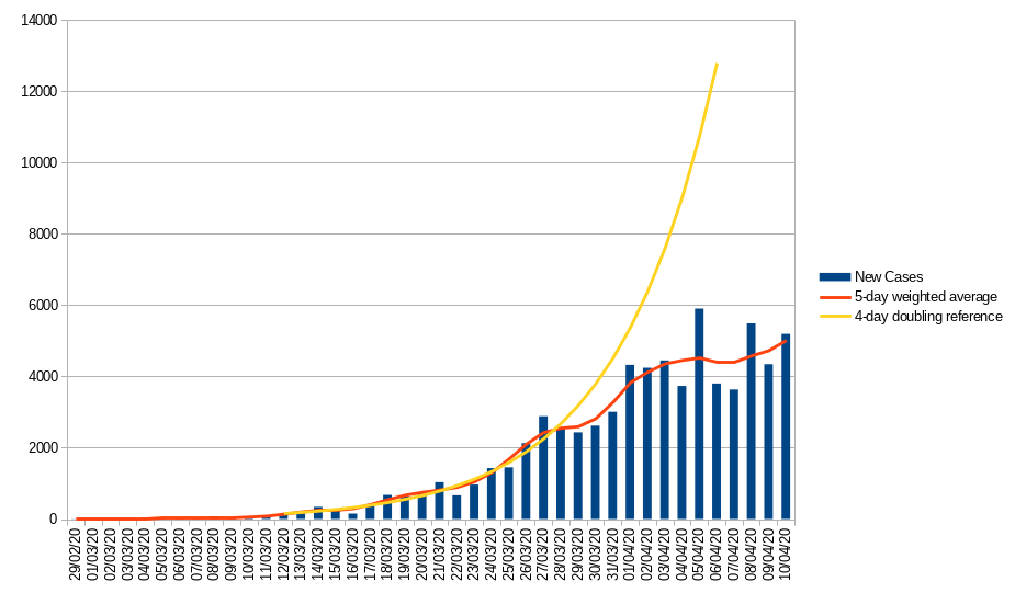
I guess one of the foremost questions on people’s minds is “is the lockdown working?”
For the UK the answer would appear to be “yes” - looking at the number of new cases there seems to be a rapid fall away from the 4-day doubling trajectory that we were on, about 5 days after the lockdown started.
The bar graph represents the official “confirmed new cases”, the yellow line a 4-day doubling reference and the red line a 5-day weighted average (looking two samples back and two forward from each data point).
Now there are many weaknesses in the official data - it only includes in-hospital deaths, is almost certain to suffer from a degree of reporting lag and only captures the “tip of the iceberg” as most cases are still not being tested as they are not ill enough to be admitted to hospital but if we assume that they are at least consistently inaccurate we can use them to identify trends.
The French data is a bit harder to interpret as it has been very volatile recently - that said there seems to have been a distinct slow down in new cases starting about 5 days (the average incubation period) after the lockdown began, initially dropping to double every 9 days and dropping again in the last week or so.
For this graph I have deliberately removed the 17,827 additional community deaths reported on the 3rd of April leaving the 5k or so hospital deaths that day. Yellow is, again, a 4-day doubling reference, in addition I have added a 9-day doubling reference starting March 23rd. Even adjusting for the bulk addition of community deaths on a single day the numbers reported have been very volatile for the last two weeks so you really need to look at the averaged data.
For the moment I am taking the data on face value but the UK figures do look a bit too neat - I hope the figures are not being massaged but the government has lied about almost everything else so why not this?
On the face of it neither country has yet reversed new case numbers, though both have significantly slowed the spread - which gives some breathing space to the health service and avoids high numbers of fatalities simply because hospitals are saturated.
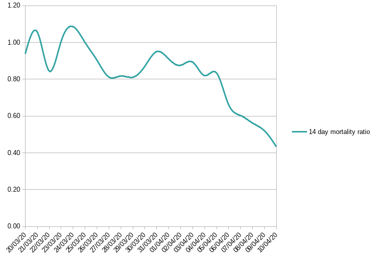
One other interesting bit of data is that the mortality ratio for UK “completed” cases is dropping.
A while ago deaths as a %age of new cases about 14 days previously (the lag between a positive test result and death) was running about 80% - but now seems to be down to 40%
I am not sure of the reason for this but some possibilities spring to mind
I honestly don’t know but if we are trying to use historic mortality ratios to predict deaths from the last 14 days (or so) of new cases we’d have to say that things look rosier. Nevertheless we have had 55729
“official, confirmed” new cases in the past 14 days and if 40% of those die we are still looking at more than 20k deaths in the next two weeks.
Thanks @anon88169868 interesting analysis.
I note the bbc mentioned that the uk mortality figure doesn’t include care home deaths. Aaargh.
Paul’s analysis is great and obviously show the trends but the real problem is that none of the figures are accurate enough. There are a lot of loopholes in the way that the daily deaths are collated and reported but the great unknown is the number of new cases. To highlight this you don’t have to look beyond Kenny Dalgleish. He has joined the number of new cases but only by accident. He was tested routinely when he went to a hospital appointment and was found to have the virus. He displays no symptoms and has not felt ill How many Kennys are there out there? A thousand? Ten thousand? A million? More?
Until the daily numbers are known to be accurate trends are the best that we can hope for.
As a Liverpool fan such a question is nearing blasphemy! There is only ONE Kenny Dalglish.
My husband is a LFC fan.
No football hooray.
Without reasonably wide scale population testing it is difficult to know - you don’t have to test everybody, just a representative sample so it could be done but there seem no moves to do so.
One can estimate it from number of deaths - but only by making several assumptions but if you work on an overall case fatality of 3% then 980 deaths means roughly 32.6k symptomatic cases. These would have been testing positive around 14 days ago - the official figure on that day was just 2885 so it is reasonably to assume the true number of cases is about 12x the official number - or maybe 800k, given that Covid19 is actually asymptomatic in many patients multiply that 800k by anything up to 3 to get maybe 2.4 million who have been infected.
It’s difficult though - these are different answers to the last time I ran through the figures (however the data has changed since then) and there are estimates kicking around from a couple of million up to perhaps as many as 20 million infected.
I don’t actually see the point of testing random samples. What good does that do if you’re not going to test everybody.
I can see the point of testing everybody, so that those who test positive know to self isolate. That would make a big difference in stopping the thread.
But knowing that x% of the population has the virus, whilst no doubt fascinating for number crunchers, seems singularly pointless if you don’t know which those people are. By tomorrow they will each have passed to on to more people or whatever it is, so your percentage will be out of date.
We’re past the point of it being particularly useful to know who is infected at an individual level, but knowing what %age of the population have been is essential to know how far we are through this crisis, when the load on the NHS might peak, when we might be able to relax restrictions etc is invaluable - it’s just not being done.
Boo !
Yes for sure. 10 to 12 times, that to me is much more realistic. If the government had a applied a fudge factor in estimated infected, and tested infected; the population may have taken it more seriously. As it is they don’t think anything of 73,000 total being infected out of a population of 64 million. When the true factor has to be in the region as you say, roughly 1 to 3 million. A % of which have now had it and recovered.
If the government had used a little modelling , just as you managed to do Paul; then released it to the public; they would not have such a hard job of controlling the public to stay at home.
But i suspect they have done the modelling, but not wanted to publicise it to scare people.
Going by the softly softly approach to telling how the police to treat the public, it would match that ethos. Now they reap the reward by making the police’s job a bloody nightmare.
Meanwhile it is evident that significant numbers of deaths are taking place outside hospital and the government has just released figures from testing key workers and their households pushing the numbers of positive cases up by nearly 3.5k
Wow! Impressive analysis. Very interesting and even a little reassuring.
Thanks
Izzy x
It might also help if the UK Government changed their “3 line mantra” to make people sit up and listen.
During the Brexit debate, the mantra was “our money, our borders our laws” to which people mainly switched off after hearing it ad-nauseam. Now, of course, the same pattern emerges (as if to say it enough times people will take notice - the don’t!) “Stay Home > Protect the NHS > Save Lives” mantra.
Now, having watched French TV regularly since the lock down (the FTA Sky stuff is basically nauseating) I have noticed that the French Government have a much better policy on their public information message. The same message is not blindly repeated but is changed which psychologically encourages people to sit up and take more notice of it.
Hi Anna, the test that would be useful is the one that shows if people have had the virus. Anyone who has had it would (theoretically) be immune/not infectious and could be released from isolation to go back to work etc. People could be given an immunity certificate perhaps.
Hope you’re all enjoying this lovely weather.
Izzy x
but - do you feel lucky? is immune (personally) and not infectious (to others) the same in this context?
Hi Graham, who knows? There are reports of people getting it a second time but I’m not sure if that is true or not. I think I would like to know if I have had it and whether or not I could pass it on to others. Just putting my thoughts out there.
Izzy x