Whatever your view of them, statistics is the cornerstone of most medical research, used wisely they are indispensable for interpreting data.
3 Likes
“Salaries for experienced government statisticians range from £44,000 to £50,000. Salaries for those based in London are higher.”
Seems like we could save a shedload of dosh if we got rid of some of those guys - or would we?
Yes but they’re only as good as the data they use.
When the data is limited, and/or not reliably collected, as is the case now, statistics can be dangerously misleading.
Ultimately, yes.
UK 8th April 5491 new cases and 938 new deaths.
There was a midweek surge in cases last week, maybe some lag in reporting but, as ever it is disappointing to see it go up.
The number of deaths continues its almost predetermined rise.
The French numbers are a puzzle as well, they seem to be all over the place at present.
This one is for the Staticians:
1 Like
I think you seem to follow ( interpret) the info similar to myself Paul ( also with an insight that i do not have).
I was thinking of the reporting lag, and possibly total deaths, instead of segregating CVid from all others ( depending on what is read. But cannot be too far off, for a small % fudge factor.
I think people get confused when informed that perhaps the “lockdowns” are starting to have an effect to flatten the curve, yet we see many more deaths and still on an upward trend.
What they fail to understand is the timescale factor; in the current days mortality, relate to infections anything from 2 to 4 weeks prior. And it is that part of the graph to look at the mortality in days to come.
IF the government had managed to introduce a much more stringent testing, then that forecast of mortality would be a little more accurate.
But as we can only go on those that have been tested ( in hospital), the graphs of those infected to mortality is probably 7 to 10 days ?
So how you interpret infection to mortality, from country to country; will depend on their method of testing back along.
1 Like
I do not know what is wrong with today’s update - it is very late, and it is always yesterdays figures which makes it more “odd”.
The source for the UK numbers in worldometer is here :- https://www.gov.uk/guidance/coronavirus-covid-19-information-for-the-public
And there are 3 separate para’s, with 3 different days on them . I’m sorry but i am sure this is actually designed to confuse. I mean just look at this nonsense, could have been written by a 10 yr old.
"As of 9am on 8 April, 282,074 tests have concluded across the UK, with 14,682 tests carried out on 7 April. Some individuals are tested more than once for clinical reasons.
232,708 people have been tested, of whom 60,773 tested positive. Today’s figure for test data does not include Charing Cross and Southampton due to a data processing delay. The tests concluded figure excludes data from Northern Ireland.
As of 5pm on 7 April, of those hospitalised in the UK who tested positive for coronavirus, 7,097 have died."
“9am on 8 April, 282,074” . Yes those were yesterday ( Wednesday) current tested figure.
“7 April … 7,097 have died.” Yes those were the figures for Tuesday - released about 2 pm on Wednesday !!
France’s stats look quite worrying, but they do look inconsistent. I would read between the lines that the reports are not coming in, in time to be correlated correctly.
9th April UK 4344 new cases and 881 deaths.
The deaths figure is perhaps interesting as it is static/slightly down whereas new cases was going up 14 days ago - possibly more thoughhts on that later.
10th April 5195 new cases and 980 deaths.
OK, I promised a bit of analysis.
I guess one of the foremost questions on people’s minds is “is the lockdown working?”
For the UK the answer would appear to be “yes” - looking at the number of new cases there seems to be a rapid fall away from the 4-day doubling trajectory that we were on, about 5 days after the lockdown started.
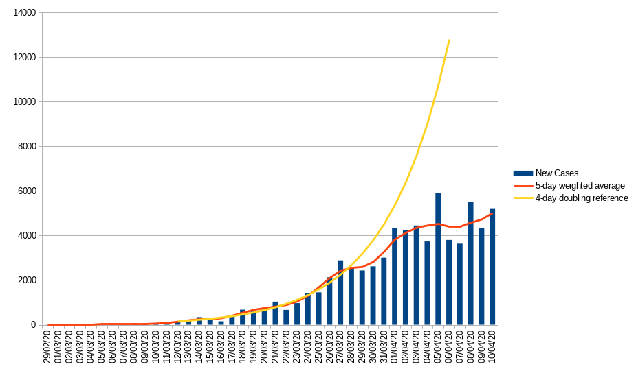
The bar graph represents the official “confirmed new cases”, the yellow line a 4-day doubling reference and the red line a 5-day weighted average (looking two samples back and two forward from each data point).
Now there are many weaknesses in the official data - it only includes in-hospital deaths, is almost certain to suffer from a degree of reporting lag and only captures the “tip of the iceberg” as most cases are still not being tested as they are not ill enough to be admitted to hospital but if we assume that they are at least consistently inaccurate we can use them to identify trends.
The French data is a bit harder to interpret as it has been very volatile recently - that said there seems to have been a distinct slow down in new cases starting about 5 days (the average incubation period) after the lockdown began, initially dropping to double every 9 days and dropping again in the last week or so.

For this graph I have deliberately removed the 17,827 additional community deaths reported on the 3rd of April leaving the 5k or so hospital deaths that day. Yellow is, again, a 4-day doubling reference, in addition I have added a 9-day doubling reference starting March 23rd. Even adjusting for the bulk addition of community deaths on a single day the numbers reported have been very volatile for the last two weeks so you really need to look at the averaged data.
For the moment I am taking the data on face value but the UK figures do look a bit too neat - I hope the figures are not being massaged but the government has lied about almost everything else so why not this?
On the face of it neither country has yet reversed new case numbers, though both have significantly slowed the spread - which gives some breathing space to the health service and avoids high numbers of fatalities simply because hospitals are saturated.
One other interesting bit of data is that the mortality ratio for UK “completed” cases is dropping.
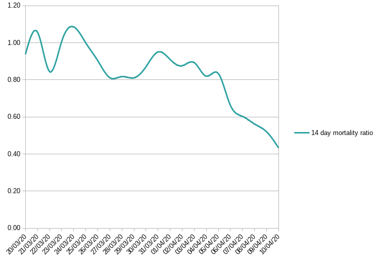
A while ago deaths as a %age of new cases about 14 days previously (the lag between a positive test result and death) was running about 80% - but now seems to be down to 40%
I am not sure of the reason for this but some possibilities spring to mind
- it s possible that increased testing is allowing identification of more mild cases (with correspondingly better outcome)
- it could be that we are actually better at treating patients and more are surviving
- it could be that test results are coming in faster - early on it might take 5 days to get a positive result back. I think this is now within a few hours - this has the effect of stretching the time from diagnosis to death (i.e we’d have to look further back in the data with correspondingly fewer numbers and a higher mortality ratio)
- it could just be that the data is “maturing” - early ratios were on comparatively few patients
I honestly don’t know but if we are trying to use historic mortality ratios to predict deaths from the last 14 days (or so) of new cases we’d have to say that things look rosier. Nevertheless we have had 55729
“official, confirmed” new cases in the past 14 days and if 40% of those die we are still looking at more than 20k deaths in the next two weeks.
11 Likes
I note the bbc mentioned that the uk mortality figure doesn’t include care home deaths. Aaargh.
Paul’s analysis is great and obviously show the trends but the real problem is that none of the figures are accurate enough. There are a lot of loopholes in the way that the daily deaths are collated and reported but the great unknown is the number of new cases. To highlight this you don’t have to look beyond Kenny Dalgleish. He has joined the number of new cases but only by accident. He was tested routinely when he went to a hospital appointment and was found to have the virus. He displays no symptoms and has not felt ill How many Kennys are there out there? A thousand? Ten thousand? A million? More?
Until the daily numbers are known to be accurate trends are the best that we can hope for.
3 Likes
As a Liverpool fan such a question is nearing blasphemy! There is only ONE Kenny Dalglish.
5 Likes
My husband is a LFC fan.
No football hooray.
1 Like
Without reasonably wide scale population testing it is difficult to know - you don’t have to test everybody, just a representative sample so it could be done but there seem no moves to do so.
One can estimate it from number of deaths - but only by making several assumptions but if you work on an overall case fatality of 3% then 980 deaths means roughly 32.6k symptomatic cases. These would have been testing positive around 14 days ago - the official figure on that day was just 2885 so it is reasonably to assume the true number of cases is about 12x the official number - or maybe 800k, given that Covid19 is actually asymptomatic in many patients multiply that 800k by anything up to 3 to get maybe 2.4 million who have been infected.
It’s difficult though - these are different answers to the last time I ran through the figures (however the data has changed since then) and there are estimates kicking around from a couple of million up to perhaps as many as 20 million infected.
1 Like
I don’t actually see the point of testing random samples. What good does that do if you’re not going to test everybody.
I can see the point of testing everybody, so that those who test positive know to self isolate. That would make a big difference in stopping the thread.
But knowing that x% of the population has the virus, whilst no doubt fascinating for number crunchers, seems singularly pointless if you don’t know which those people are. By tomorrow they will each have passed to on to more people or whatever it is, so your percentage will be out of date.
We’re past the point of it being particularly useful to know who is infected at an individual level, but knowing what %age of the population have been is essential to know how far we are through this crisis, when the load on the NHS might peak, when we might be able to relax restrictions etc is invaluable - it’s just not being done.